Cross-Device Compatibility Part of our Responsive Website services
About Cross-Device Compatibility
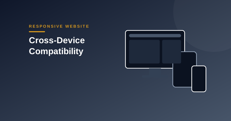
We develop websites that provide a consistent and reliable experience across smartphones, tablets, laptops and desktop computers. Layouts, navigation, images and interactive elements are optimized for different screen dimensions so users can comfortably browse and interact with your website from virtually any modern device.
Different screens, resolutions and orientations can break layouts. We test and refine so your site behaves the same everywhere.
Execution Details
What We Deliver
| Screens | Small phones to large monitors |
|---|---|
| Resolution | Standard and high-density displays |
| Orientation | Portrait and landscape |
| Input | Touch, mouse and keyboard |
| Report | Issues fixed summary |
What We Need From You
- Website link
- Devices important to you
- Known problems
- Analytics data (optional)
How It Works
Discovery
We review your requirements, goals and existing setup.
Plan & Design
We agree scope, structure and design direction.
Build & Test
Development with testing across devices and scenarios.
Launch & Support
Go-live, handover and ongoing support options.
Cross-Device Compatibility FAQs
Frequently asked questions about Cross-Device Compatibility.
Yes, along with browser emulators for wide coverage.
Yes.
Yes.